It’s difficult to dislike the colour blue. Perhaps it’s because we live under a blue sky that the colour blue features so often in our clothing and in our interiors.
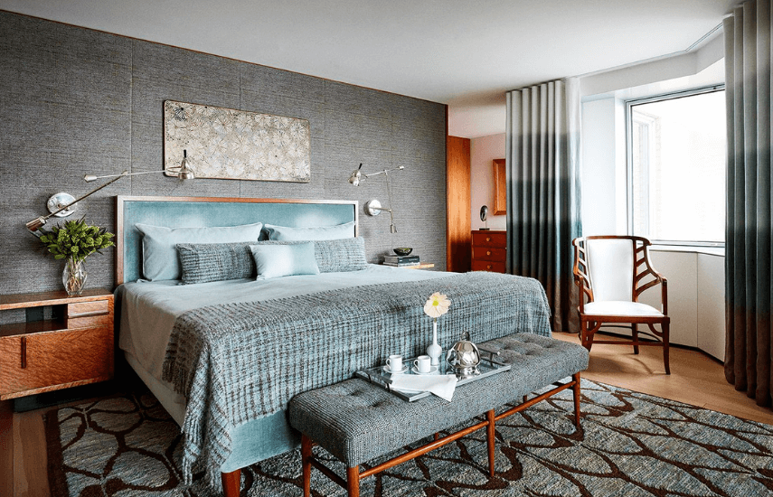
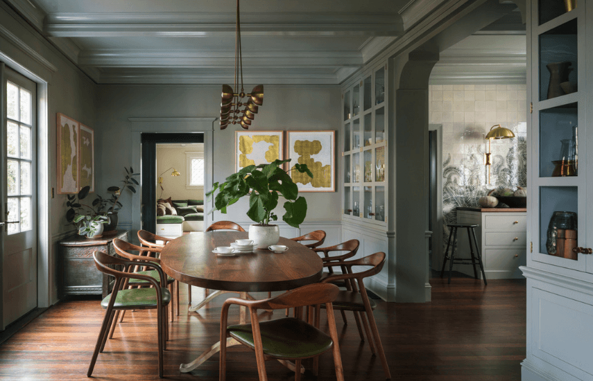
This first image is of a bedroom that I could very happily cut and paste into my real life. This grey-blue is simply an easy colour to live with and lends itself to a wide variety of interior styles – from the first image that has Mid Century overtones to the second with a distinctly contemporary country feel.
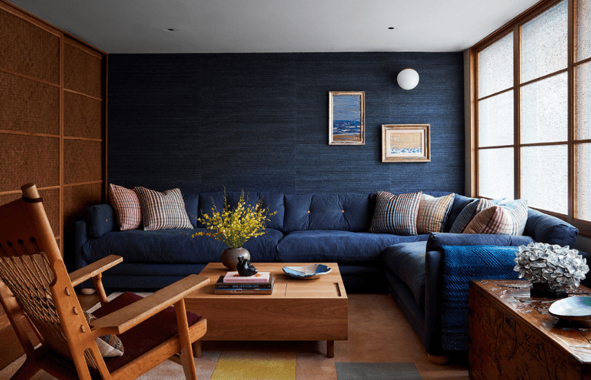
Navy is also a classic shade of blue. The combination of navy grasscloth on the wall with a sumptuous navy sectional makes this room feel like somewhere you’d be happy to spend a few idle hours.
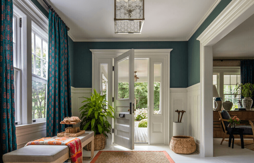
Blue tones can also veer towards green which, partnered with crisp whites, create a welcoming entrance.
One of the reasons that blue works so well in interiors is because it is complimentary (opposite on the colour wheel) to orange. Many timbers contain orange tones so the combination of timber and blue always has that dynamism that complimentary combinations bring.
Is there room for a little more blue in your life?
More info on the designers of these four rooms via the links below.
1. Simone Haag
4. Thom Filicia


