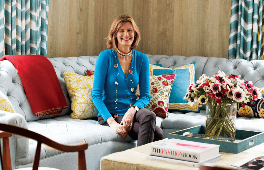
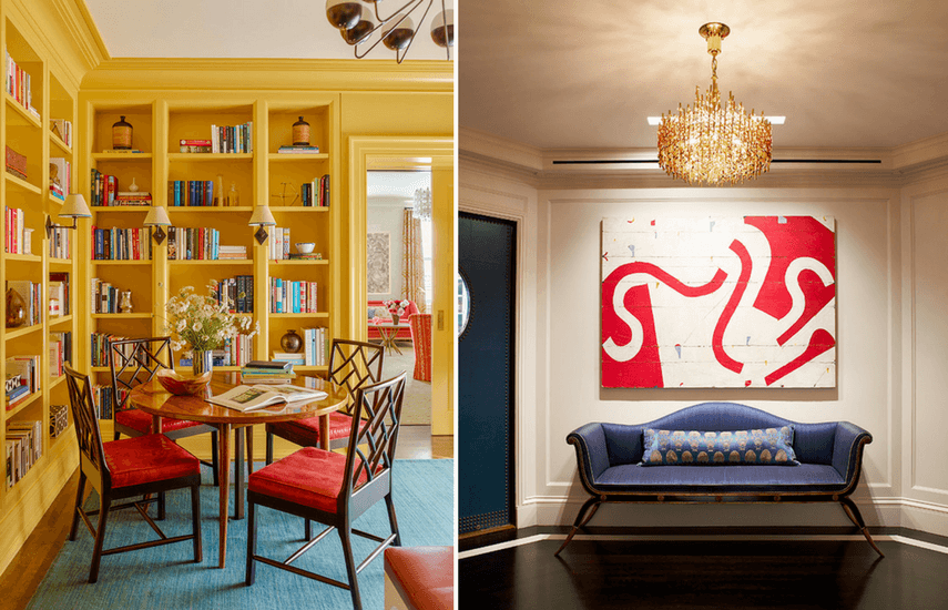
Katie Ridder’s former career as an editor at ‘House Beautiful’ magazine provided a great education for her current career as an Interior Designer.
“I was able to follow other designers around and see things through their eyes. It was sort of like being an assistant for many different designers.”
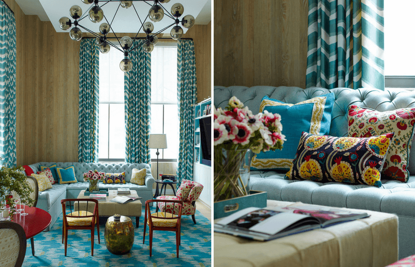
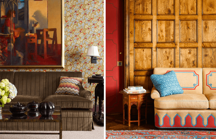
One of the striking aspects of Katie’s designs are her bold colour palettes.
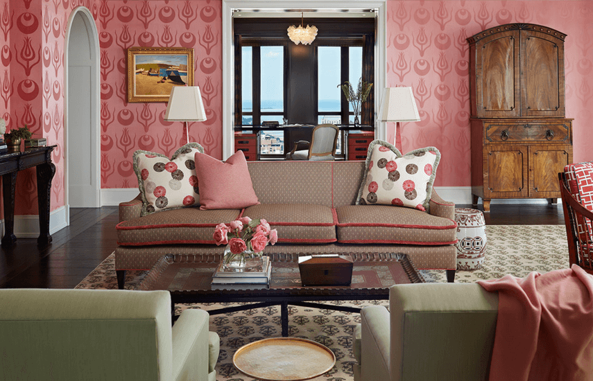
Of colour she says “One of my very favorites is Indian pink with denim blue and touches of yellow. But there’s really not a colour I don’t like. I like greens with purples and magentas. Those are such great colours to work with too.”
Katie has a playful approach to mixing antique and modern pieces and draws her inspiration from a wide range of designers, styles and eras.
“I’m so inspired by the architects and furniture designers Karl Schinkel (19th Century) and Charles Voysey (20th Century), and I love the store Svenskt Tenn in Sweden.”
As New York Home observed, Katie Ridder’s “trademark is the ease with which she bridges cultures and continents, high and low art, periods and styles. Yet to call her work eclectic is to miss the point, for while it reflects diverse influences, it’s recognisably the product of a single sensibility – one with a distinctive take on colour, texture, proportion and scale.”
