I love a splash of dirty orange. To me it has a timeless appeal and fits into all sorts of different interior styles. It’s warm, energising and makes everything around it look more interesting.
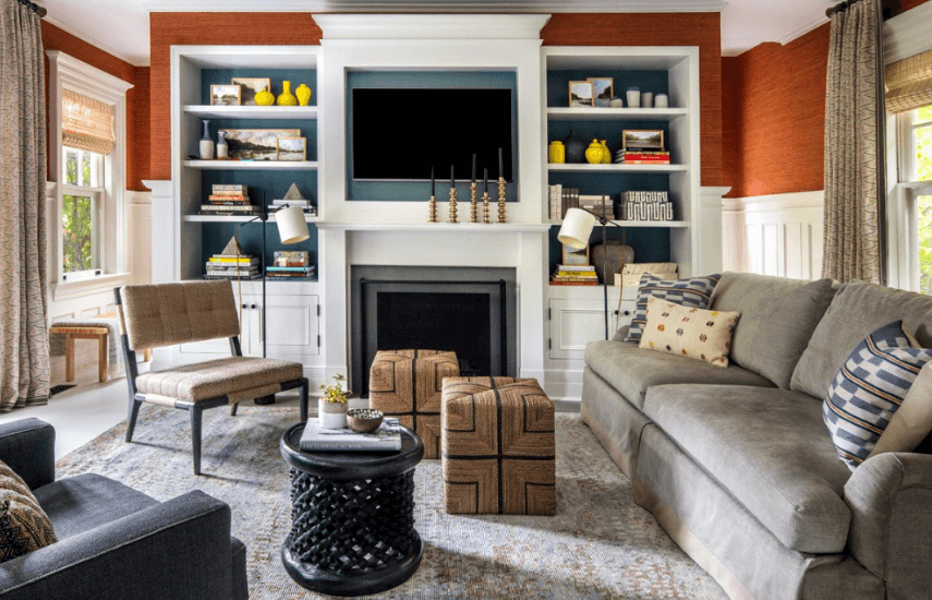
Take away the grasscloth wall covering and this living room is still nice, but it’s no longer fabulous. The orange brings contrast to the space and makes the slate blue and neutrals look so much more special.
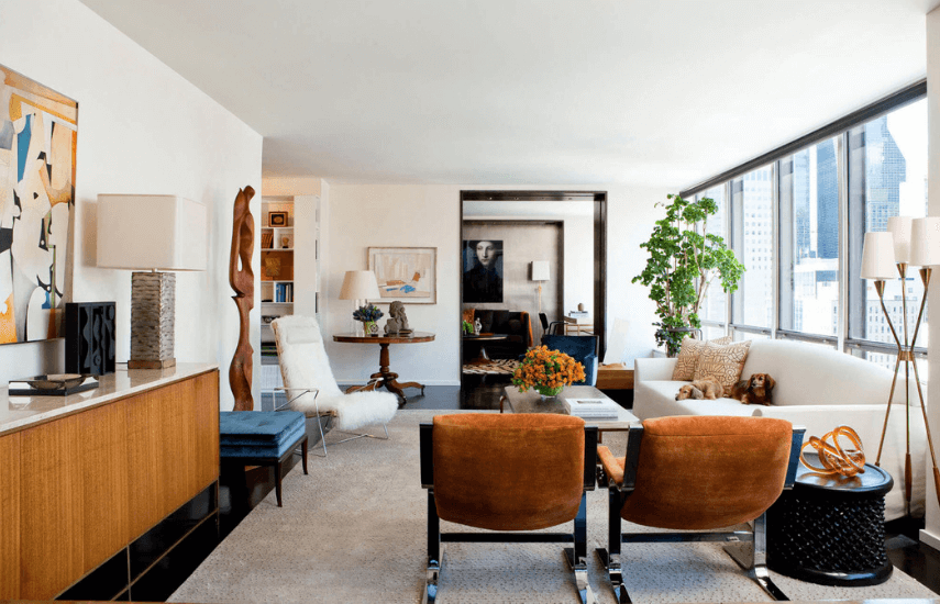
When you have warm, golden timber furniture pieces, repeating a similar orange colour in other elements acts as a glue to pull the whole room together. Your eye moves from the timber sideboard to the velvet armchairs and glass sculpture to the flowers, timber sculpture and back to the sideboard again. Even the dogs on the sofa have been colour coordinated!
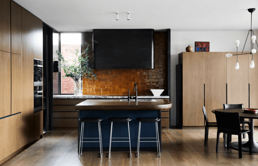
Hand-made orange tiles bring a personal touch into this luxe, but restrained kitchen/dining area. See again how orange plays so well will a touch of blue – this time an inky navy. It’s because they’re complimentary (opposites) on the colour wheel.
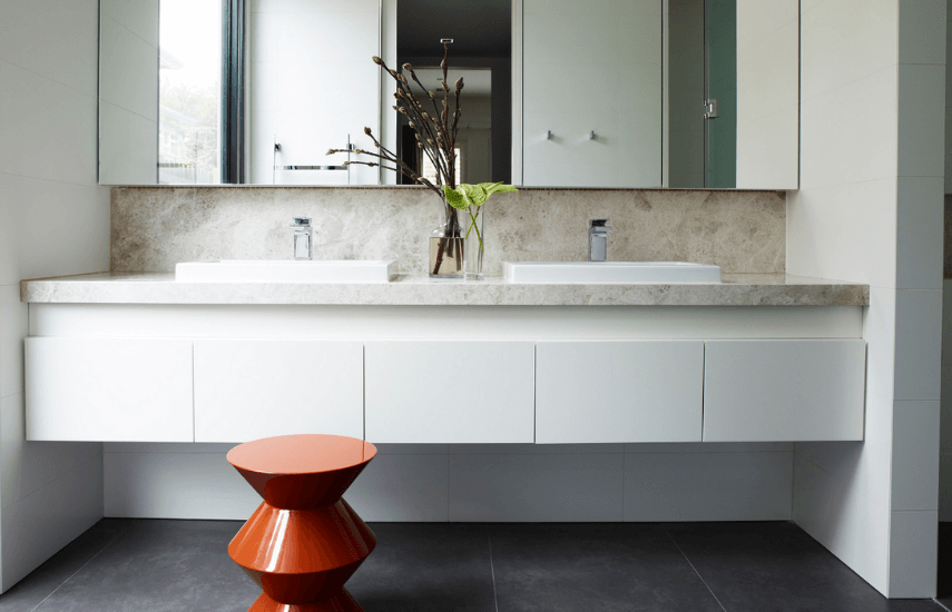
And if your bathroom is feeling a little too cool, calm and collected, try an orange stool or perhaps some orange towels …..
Take a base of pure 1970s Telecom orange and mix in a little charcoal. That’s what makes it dirty, and it’s the dirtiness that makes it a colour that fits in just about anywhere.
More info on the designers of these four spaces via the links below.
1. Thom Felicia
2. David Scott
3. Flack Studio
4. MIM Design


