Colours makes me happy and I love them all. It’s only when combining multiple colours into interior design schemes that my favourites really start to emerge.
I always respond to interiors that contain quite a few different colours. For me all rooms need books, art and people to truly come alive. Books, art and people come in lots of different colours. I draw the line at arranging shelves of books so their spines match the cushions (however Insta-popular). And you wouldn’t refuse entry to your dearest friend because the colour of her jacket clashes with your sofa (would you?)
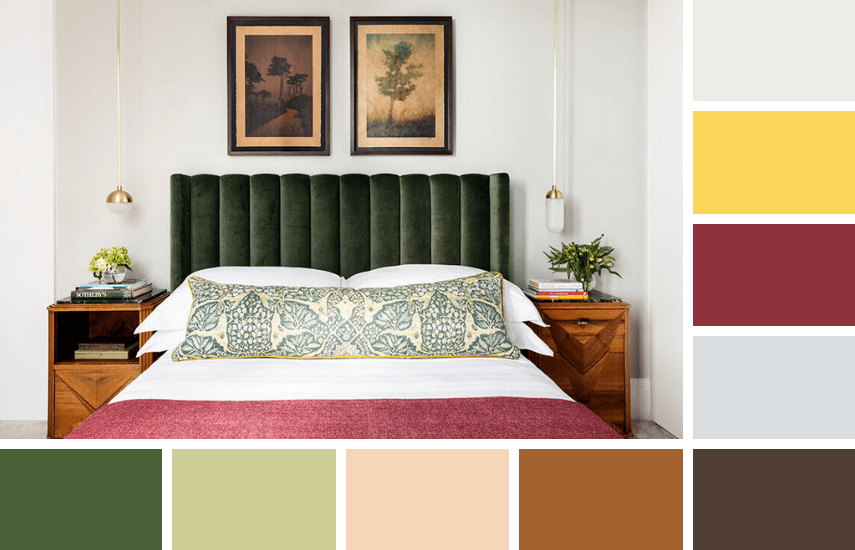
This first image is a gorgeous colour scheme, particularly for an older home. Greens and pinky reds are complimentary (opposites) on the colour wheel. Take away that pinky red blanket and you’re left with just a nice, rather than a fabulous, colour scheme. (Plus the golden yellow piping on the cushion is genius – yes, us interior designers are obsessive when it comes to details!)
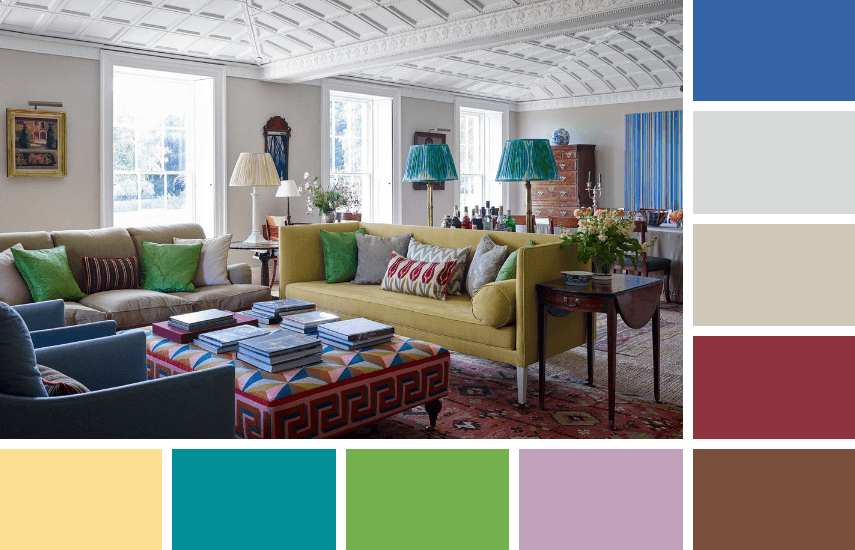
The second image is a colour carnival. It would be almost impossible to mope around miserably in these surroundings! But the colours are kept in check by being in a large space with bright white walls and ceiling. They are also grounded by the dark antique furniture pieces scattered throughout.
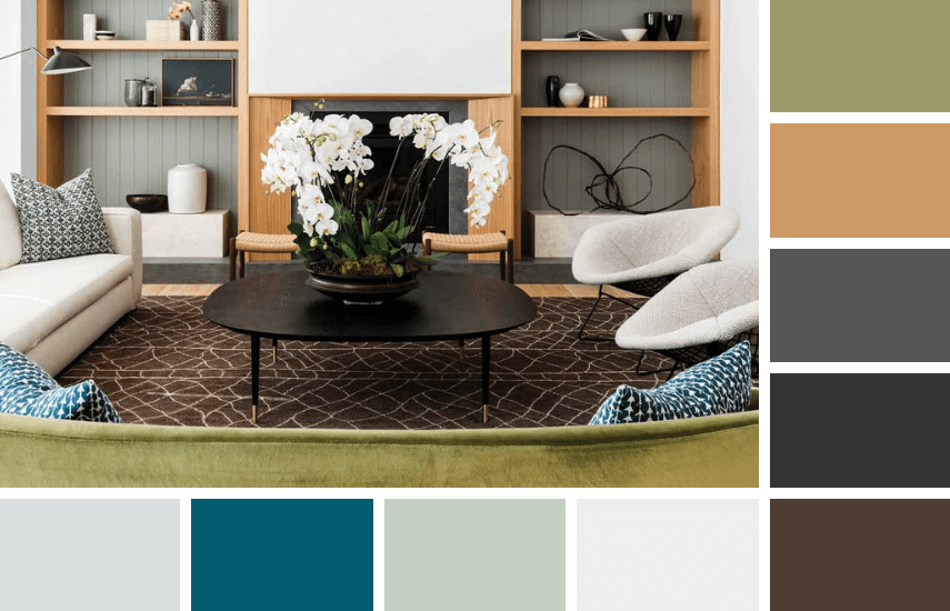
This third image is a great example of a quintessentially Australian colour palette of sun-bleached neutrals. The chocolate rug and dark timber coffee table contrasting with the luxuriant white orchids bring focus to the conversation area.
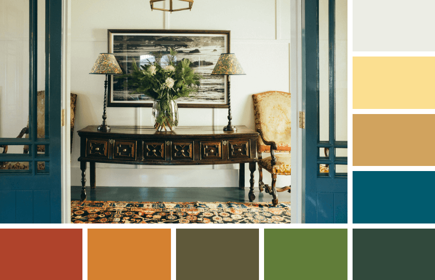
And lastly, an image to show how you can use lots of contrasting colours without overwhelming a small space. Here used in small patterns on upholstery, rugs and lampshades with contrasting blue paintwork on the door.
More info on the designers of these four rooms via the links below.
1. Studio Ashby
3. Arent Pyke


